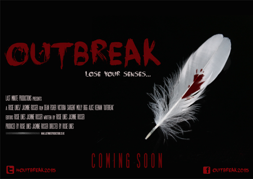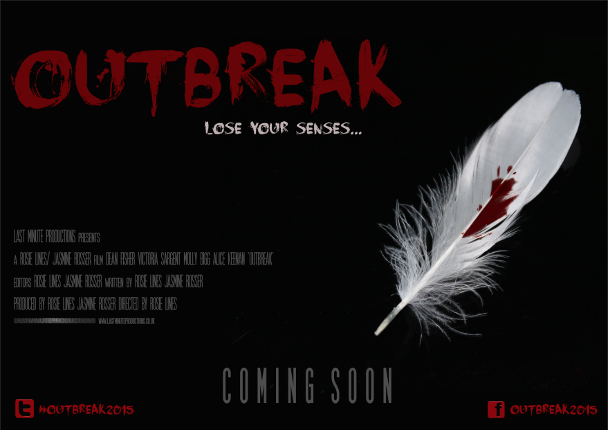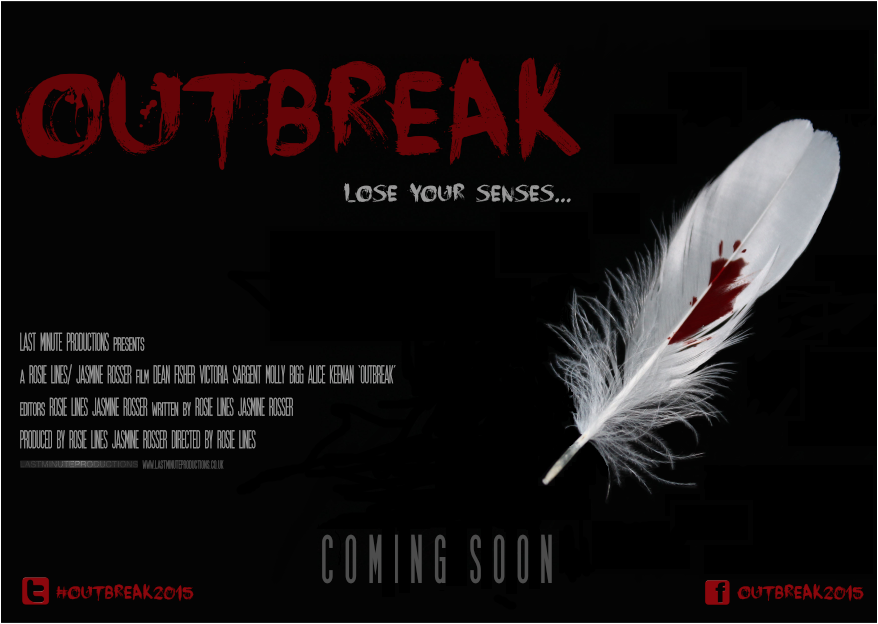


Both preliminary poster designs have been hand drawn and are subject to change depending on what best conveys across the horror genre. For now, I have chosen a white background as I feel as though simplicity is key for a film poster; personally, I feel as though if I place many images and graphics on my poster, it will deter away from what I am trying to promote essentially. Moreover, having a basic layout of title, tagline, billing block, release date and social networking links will encourage the audience to search for the answers via the social networking links provided at the bottom right corner.
