31 March 2015

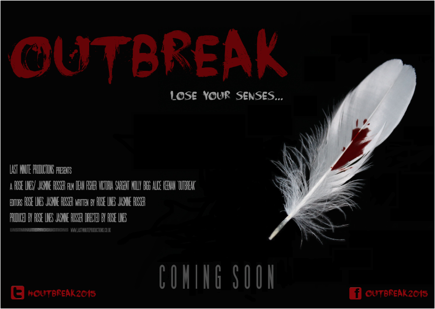
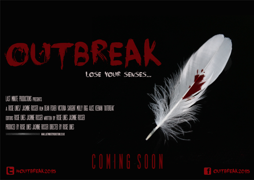
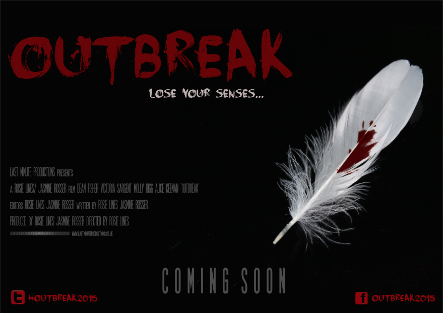
Final Film Magazine Cover Designs

 First Design

Second Design

Third Design


Outbreak - Final Teaser Trailer


Outbreak - Third Draft


Today Jasmine and I presented our third and final draft of our teaser trailer to our A-level media studies class. After taking into consideration other improvements suggested by the same group of individuals, Jasmine and I wanted one final chance to see what other improvements could be made before we finalise the teaser trailer.

Changing the font style of social networking links

A suggestion made was the changing of font style for the social networking links; not only for presentation but forThe last improvement they suggested was to make the background music a bit louder when the news report fades out, by doing this it will straight away build suspense instead of the audience waiting for the music to build up.
  • To change the font of the social networking sites.
  • Make the background music louder, straight from when the news report finishes.

30 March 2015

Outbreak - Second Draft


After receiving feedback for our first draft of our teaser trailer, Jasmine and I presented the second draft of  'Outbreak' which has taken into consideration the necessary improvements suggested by our target audience. Although alterations have been made, our teaser trailer is still in the development process therefore, Jasmine and I still require audience feedback to make further improvements. 

Levelling of social networking links

The width between the social networking link needs to be smaller and placed at the centre of the screen in order for them to be easily seen.

News Report

'...The news headlines at 1 o'clock. Health care officials within the pass hour have declared that over a third of accident and emergency departments across Britain are on red alert. Later today, Prime Minister David Cameron plans to visit Kings Cross hospital to see first hand, how the NHS are dealing with the demands of treating the infected...'

'...Symptoms consist of bleeding from nose, eyes, ears and mouth, followed by loss of smell, taste, hearing and in some cases, sight. If anyone is suffering from the symptoms stated, Do not leave your household, remain calm and contact 999 immediately...'

27 March 2015

Recording The News Report

Due to Jasmine and I creating a teaser trailer, we want questions to be asked about what the spectator is being presented with. Therefore, information that supports what the narrative is about, will be present within the first scene (Dean in the gym). I suggested that similarly to Edgar Wright's zombie comedy 'Shaun of the Dead', a news report could play at a minimal sound level in the background of the scene.


This is a reference to when Shaun is seen exiting the Indian-run deli, which is tuned to a radio station playing songs from Indian movies, the song stops and a newscaster begins speaking in Hindi. The content of the news, when translated in English, is, "People are waking up from their graves.". Unlike 'Shaun of the Dead', the language would be English and the news report would be playing throughout whilst Dean is seen lifting weights. This way, the spectator would have to fully concentrate and possibly re-watch the clip to understand that a epidemic has begun, what the symptoms are to look out for and what to do in the event of becoming infected. Moreover, the audio used would foreshadow what later happens within the trailer and ultimately, allow the audience to understand that the normality and equilibrium of the protagonist lifting weights is broken when we later find out, he has begun to suffer from channel virus symptoms.
Outbreak - First Draft


Within class, Jasmine and I presented the horror teaser trailer first draft to our A-Level media studies group. The reason we decided to present the teaser to this group was due to the majority of individuals in the same A2 media class as us fall under our product target audience. Below, is the list of feedback we received after presenting our virus sub-genre product.

Louder Audio
Louder audio (specifically the news report that plays within the gym scenes). Due to this being a first draft, the news report that plays in this version is a BBC 6 o'clock news report. Jasmine and I plan to record our own radio news report that will help the audience acknowledge the symptoms of the virus. Not only will our news report follow the same formality and structure as a professional news report, it also will allow the audience to acknowledge how the protagonist has become victim to the virus.
Here is a list of useful resources I have found online that have helped me to write a clear and concise news report -

How to write a news report - http://www.google.co.uk/urlsa=t&rct=j&q=&esrc=s&source=web&cd=15&ved=0CGMQFjAO&url=http%A%2F%2Fschools.peelschools.org%2Fsec%2Flornepark%2FSiteCollectionDocuments%2FEQAO2FOSSLT%2520StED-Writing%2520A 2520News2520Report.pdf&ei=HpcmVb74BpXiaqWKgJAN&usg=AFQjCNFZw95Gs4pYXc1DG_0mwDYkrp8d1w&bvm=bv.90237346,d.d2s


Charlie Brooker's 'How to report the news' -


Social Networking Links

A few individuals mentioned that the last shot which shows social networking links for the consumer to further discuss the film, could be more visible by altering the shade of the font colour and changing the font style altogether.

Pacing of each shot shown

The duration of each shot within the teaser trailer eventually decreases in order to build tension; the first initial shots within the gym sequence, last approximately 3 seconds. Yet, as the teaser trailer progresses, the shots begin to last for approximately 1/2 seconds; this is due to Jasmine and I wanting both visuals and audio to go hand in hand; this is know as synchronous sound (sound that is in sync with the visuals) building tension. An improvement that was suggested was the ordering of shots, in particular, the scene showing an infected victim bleeding from the mouth; our target audience found that it was difficult to see the blood as the duration of the shot was too short.

26 March 2015

Final Ident Design


Above, is our final ident design. After researching the codes and conventions of existing idents, my group and I collated a list of potential effects to add to our own ident design. Dean was responsible for the design you see here. This stage of the production process wasn't dependent on receiving feedback from our target audience as idents are an opportunity for a production company to create something visual that represents what they are all about. Occasionally, Dean would ask Jasmine and I for feedback on whether or not the ident he was creating conveyed across what our group was about. Moreover, Dean also decided our production company name 'Last Minute Productions'. Jasmine and I thought this summed up our group and our teaser trailer assignment nicely; not only was our A-level media class allocated a limited amount of time (making everything feel last minute) but Jasmine, Dean and I have all experienced first hand the responsibilities and tasks carried out by professional production companies (all be it on a smaller scale).

Ident Research - Hammer, Twisted Pictures and Blumhouse

Hammer


The fading of key moments from previous Hammer productions in concept art form, adds to the audiences understanding on what Hammer are known for and what to expect from the following film; although, images used may require the spectator to have prior knowledge of what film each shot of concept art belongs to. The word 'Hammer' is the textual information within the ident, yet this is only fully visible until the end of the zooming out motion of the camera. Total duration of the ident = 12 seconds; having an ident less then 30 seconds in duration allows the spectator to remain interested and prepare themselves for the following film for a reasonable amount of time. Through gender neutral colours (reds, black, whites and blues), Hammer can appeal to both genders whilst following horror conventions. The quickening pace of the drum reminds me of a heart beating. Therefore, Hammer can begin to create tension even before the film has begun (foreshadowing).


Twisted Pictures


Within Twisted Pictures' ident, the codes and conventions of this production company's specific horror sub-genre is evident not only through visuals but through sound as well. Lower case grey lettering is a visual metaphor for the victims that are typically tortured or harmed within Twisted Picture productions having no power. According to Bourncreative ( http://www.bourncreative.com/meaning-of-the-color-grey/) the colour grey affects the mind and body by causing unsettling feelings; this relates to how Twisted Pictures' objective is to unsettle and unnerve the spectator. The tightening of thorns (much like rope) around the lettering adds to the idea of torture. Personally, I think the appearance of the metal stake and thorns looks similar to the rod of Asclepius; the Rod of Asclepius is a symbol associated with healing and medicine. Yet this juxtaposes what the audience see as scratch marks are visible once the thorns moves away. As well as this, pathetic fallacy is evident through the lightening flash that frightens both the enemy (torturing thorns) and the spectator. The duration of this ident is 11 seconds.


Blumhouse


Point of view shot throughout showing a male individual struggling to find a escape route from his uneasy and tormenting environment; the flickering of light throughout further adds to the struggle. Blumhouse make it know that they specialise in variety of horror sub-genres through a variety of mise-en-scene. For example, floating chair and bible suggests paranormal and blood seeping through the walls and damp growing on the walls suggests home invasion. Heavy breathing and an increasing heartbeat plays throughout as well as doors slamming, child's voice and a musical box which all increase in volume until they abruptly stop leaving only the ambient sound of the light bulb buzzing to be heard. The duration of this ident is 00.15 seconds.

25 March 2015

Main Image For Film Poster and Film Magazine - Photoshop Development


Above, is the original image I took of the main image needed for both film magazine and film poster.


After erasing the oven hob surface from the picture, I was left with the feather.

Due to the density of the horror blood on the feather, some of the blood seeped through to the hob surface. When the image was taken, the flash picked up where the feather has stuck onto the glass leaving the colouring of the blood uneven looking almost black.


24 March 2015

Film Poster Design - Final Earphone Design

Below, is the original photo taken from my home of earphones. Using the remaining amount of horror blood, I added a couple of droplets onto the earphone surface. The reason I have chosen to have earphones as the main image on one of the two movie poster designs for my media products is due to the fact that, one of the symptoms of my film is the loss of hearing. Not only do we use earphones to hear music through various devices but, having blooded earphones ultimately creates an enigma making the consumer wanting to find out more information as to why the earphones have a blood spatter on them.


Film Poster Design - Final Feather Design


23 March 2015

Feather Connotations

For both my movie poster and film magazine, I have decided to use a white feather as my main image. Feathers (specifically white ones) carry many connotations that can be applied to my virus sub-genre film; themes such as hope and protection. Hope applies to how the victims within our virus sub-genre film are hopeful for the viruses existence to end. Whereas, protection applies to how individuals seek protection from the ones they love yet, the ones they love, are a potential source of contamination.

Furthermore, the juxtaposition between the red blood droplets against the white feather supports both Levi-Strauss binary opposites theory and Barthes Enigma theory. The idea of two conflicting images (blood and feather) leaves questions to be answered by the consumer i.e. why is there blood on the feather? who does the blood belong to?

The close-up shot of the feather was unintended and was not drawn into the storyboard. Yet, whilst on location, I suggested to my group members that filming the single feather and adding fake blood to it from our horror make-up kit could serve a purpose within our film.

Poster Development


Both preliminary poster designs have been hand drawn and are subject to change depending on what best conveys across the horror genre. For now, I have chosen a white background as I feel as though simplicity is key for a film poster; personally, I feel as though if I place many images and graphics on my poster, it will deter away from what I am trying to promote essentially. Moreover, having a basic layout of title, tagline, billing block, release date and social networking links will encourage the audience to search for the answers via the social networking links provided at the bottom right corner.

20 March 2015

Researching How To Promote A Film

Today, I researched what the best way possible of promoting and self-distributing an independent film online. Not only did I read other filmmakers experiences of filmmaking but, I also researched what online platforms are popular, why this is, how my group and I can use these platforms and what techniques could be incorporated into how to potentially promote our teaser trailer.

http://filmshortage.com/how-to-promote-your-film-online/

http://www.animationcareerreview.com/articles/10-ways-successfully-promote-your-short-film

12 March 2015

Poster Design Progression - Thursday 12th March 2015

Thursday 12th March 2015

Today, I focussed adding movie poster title, tagline, billing block and social networking links i.e movie website, Twitter and Facebook. It is important that social networking links are visible and present on my movie poster layout as these applying to and will be used by individuals within my target audience. After carrying out my target audience questionnaire, I was able to acknowledge how all 42 candidates that answered my questionnaire, own a profile on a social networking account online. This means that I am aiming my product at web 2.0 users. Web 2.0 is the term given to describe a second generation of individuals that are able to collaborate and share information online. Not only does this mean that those who see this poster can find out more information using the links, they are also able to discuss the film itself amongst their peers.

As you can see, I have used 'Face your Fears' font design for the title, tagline and social networking links but I have used SF Movie Poster font design for the billing block. Similarly to 'Face your Fears', I downloaded the billing block font style from Dafont (dafont.com).

11 March 2015

Poster Design Progression - Wednesday 11th March 2015

Wednesday 11th March 2015

Below, is my photoshop edited image of the blooded feather. I have placed the main image in the position I would like on the movie poster. As well as this, I have decided to colouring of the background of my movie poster will be black. The reason for this is due to the fact that, black is a mysterious colour associated with fear and the unknown. Usually, this colour possesses negative connotations and is widely used with horror. Moreover, colouring my movie poster background black helps to juxtapose the white colouring of the feather and allows the feathers prescience to dominate the movie poster. I have tried to apply the rule of thirds within my design as best as I can. The rule of thirds is the theory that by placing the main image within the intersections or along the guidelines, an image becomes more balanced and enables the spectator of the image to interact more naturally. Studies have shown that when viewing images, a persons eyes usually go to one of the intersection points most naturally rather than the centre of the shot.


10 March 2015

Poster Design Progression - Tuesday 10th March 2015

Tuesday 10th March 2015

After collating my potential title font questionnaire answers, 'Face your Fears' proved to be the most popular chose of font for conveying across the virus sub-genre best amongst my target audience. Below, is my original template with font alterations added. As you can see, compared to my original design above, I have added in 'Face your Fears' font where I think it is needed for my final poster design. An area of consideration would be the font used for the creation of my billing block. In order of having a greater understanding into film poster designs, I will research whether or not film poster billing blocks are presented in the same font as the film titles themselves.


9 March 2015

Poster Design Progression - Monday 9th March 2015

Monday 9th March 2015

Below, is my preliminary poster design that is a template for what I am aiming to achieve when designing my final horror poster. Unfortunately, not all detail has been copied when I scanned through my initial sketch but as you can see, the labelling can still be seen.


Potential Sound Effects

Potential Sound Effects taken from Freesound


What I like about this sound is the atmospheric quality it could potentially bring to our virus sub-genre film. Moreover, having a sound effect that plays at the same pitch throughout adds to the idea of fearing the unknown (foreshadowing).


Much like the sound above, this sound effect builds a tense atmosphere by remaining at the same pitch throughout leaving the audience to fear what happens next.


This sound effect is a warning air raid siren recording meaning that ambient sound such as birds and traffic can also be heard which may slightly detract from


The purpose of this sound effect within our film would be for the quickening of shots shown; the sound of the bounce would be played every time we cut to a new shot.


This sound effect consists of the same pace as a heart beat yet an electric effect has been added. This adds to the audiences understanding of normality being broken as the heartbeat noise doesn't sound how it should normally do.

Preliminary Poster Designs - Earphones and Feather

Both preliminary poster designs have been hand drawn and are subject to change depending on what best conveys across the horror genre. For now, I have chosen a white background as I feel as though simplicity is key for a film poster; personally, I feel as though if I place many images and graphics on my poster, it will deter away from what I am trying to promote essentially. Moreover, having a basic layout of title, tagline, billing block, release date and social networking links will encourage the audience to search for the answers via the social networking links provided at the bottom right corner.