31 March 2015

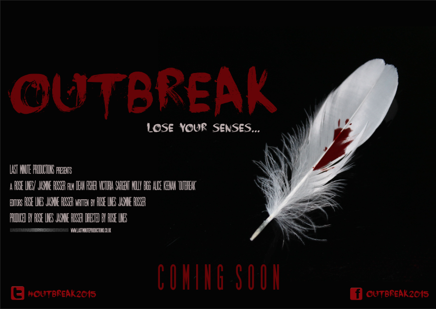
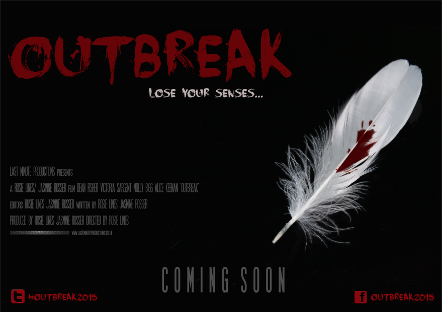
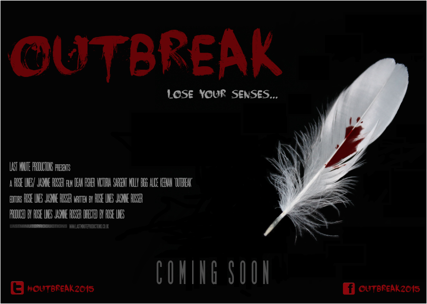
Final Film Magazine Cover Designs

 First Design

Second Design

Third Design


Outbreak - Final Teaser Trailer


Outbreak - Third Draft


Today Jasmine and I presented our third and final draft of our teaser trailer to our A-level media studies class. After taking into consideration other improvements suggested by the same group of individuals, Jasmine and I wanted one final chance to see what other improvements could be made before we finalise the teaser trailer.

Changing the font style of social networking links

A suggestion made was the changing of font style for the social networking links; not only for presentation but forThe last improvement they suggested was to make the background music a bit louder when the news report fades out, by doing this it will straight away build suspense instead of the audience waiting for the music to build up.
  • To change the font of the social networking sites.
  • Make the background music louder, straight from when the news report finishes.

30 March 2015

Outbreak - Second Draft


After receiving feedback for our first draft of our teaser trailer, Jasmine and I presented the second draft of  'Outbreak' which has taken into consideration the necessary improvements suggested by our target audience. Although alterations have been made, our teaser trailer is still in the development process therefore, Jasmine and I still require audience feedback to make further improvements. 

Levelling of social networking links

The width between the social networking link needs to be smaller and placed at the centre of the screen in order for them to be easily seen.

News Report

'...The news headlines at 1 o'clock. Health care officials within the pass hour have declared that over a third of accident and emergency departments across Britain are on red alert. Later today, Prime Minister David Cameron plans to visit Kings Cross hospital to see first hand, how the NHS are dealing with the demands of treating the infected...'

'...Symptoms consist of bleeding from nose, eyes, ears and mouth, followed by loss of smell, taste, hearing and in some cases, sight. If anyone is suffering from the symptoms stated, Do not leave your household, remain calm and contact 999 immediately...'

27 March 2015

Recording The News Report

Due to Jasmine and I creating a teaser trailer, we want questions to be asked about what the spectator is being presented with. Therefore, information that supports what the narrative is about, will be present within the first scene (Dean in the gym). I suggested that similarly to Edgar Wright's zombie comedy 'Shaun of the Dead', a news report could play at a minimal sound level in the background of the scene.


This is a reference to when Shaun is seen exiting the Indian-run deli, which is tuned to a radio station playing songs from Indian movies, the song stops and a newscaster begins speaking in Hindi. The content of the news, when translated in English, is, "People are waking up from their graves.". Unlike 'Shaun of the Dead', the language would be English and the news report would be playing throughout whilst Dean is seen lifting weights. This way, the spectator would have to fully concentrate and possibly re-watch the clip to understand that a epidemic has begun, what the symptoms are to look out for and what to do in the event of becoming infected. Moreover, the audio used would foreshadow what later happens within the trailer and ultimately, allow the audience to understand that the normality and equilibrium of the protagonist lifting weights is broken when we later find out, he has begun to suffer from channel virus symptoms.

Outbreak - First Draft


Within class, Jasmine and I presented the horror teaser trailer first draft to our A-Level media studies group. The reason we decided to present the teaser to this group was due to the majority of individuals in the same A2 media class as us fall under our product target audience. Below, is the list of feedback we received after presenting our virus sub-genre product.

Louder Audio
Louder audio (specifically the news report that plays within the gym scenes). Due to this being a first draft, the news report that plays in this version is a BBC 6 o'clock news report. Jasmine and I plan to record our own radio news report that will help the audience acknowledge the symptoms of the virus. Not only will our news report follow the same formality and structure as a professional news report, it also will allow the audience to acknowledge how the protagonist has become victim to the virus.
Here is a list of useful resources I have found online that have helped me to write a clear and concise news report -

How to write a news report - http://www.google.co.uk/urlsa=t&rct=j&q=&esrc=s&source=web&cd=15&ved=0CGMQFjAO&url=http%A%2F%2Fschools.peelschools.org%2Fsec%2Flornepark%2FSiteCollectionDocuments%2FEQAO2FOSSLT%2520StED-Writing%2520A 2520News2520Report.pdf&ei=HpcmVb74BpXiaqWKgJAN&usg=AFQjCNFZw95Gs4pYXc1DG_0mwDYkrp8d1w&bvm=bv.90237346,d.d2s


Charlie Brooker's 'How to report the news' -


Social Networking Links

A few individuals mentioned that the last shot which shows social networking links for the consumer to further discuss the film, could be more visible by altering the shade of the font colour and changing the font style altogether.

Pacing of each shot shown

The duration of each shot within the teaser trailer eventually decreases in order to build tension; the first initial shots within the gym sequence, last approximately 3 seconds. Yet, as the teaser trailer progresses, the shots begin to last for approximately 1/2 seconds; this is due to Jasmine and I wanting both visuals and audio to go hand in hand; this is know as synchronous sound (sound that is in sync with the visuals) building tension. An improvement that was suggested was the ordering of shots, in particular, the scene showing an infected victim bleeding from the mouth; our target audience found that it was difficult to see the blood as the duration of the shot was too short.

26 March 2015

Final Ident Design


Above, is our final ident design. After researching the codes and conventions of existing idents, my group and I collated a list of potential effects to add to our own ident design. Dean was responsible for the design you see here. This stage of the production process wasn't dependent on receiving feedback from our target audience as idents are an opportunity for a production company to create something visual that represents what they are all about. Occasionally, Dean would ask Jasmine and I for feedback on whether or not the ident he was creating conveyed across what our group was about. Moreover, Dean also decided our production company name 'Last Minute Productions'. Jasmine and I thought this summed up our group and our teaser trailer assignment nicely; not only was our A-level media class allocated a limited amount of time (making everything feel last minute) but Jasmine, Dean and I have all experienced first hand the responsibilities and tasks carried out by professional production companies (all be it on a smaller scale).

Ident Research - Hammer, Twisted Pictures and Blumhouse

Hammer


The fading of key moments from previous Hammer productions in concept art form, adds to the audiences understanding on what Hammer are known for and what to expect from the following film; although, images used may require the spectator to have prior knowledge of what film each shot of concept art belongs to. The word 'Hammer' is the textual information within the ident, yet this is only fully visible until the end of the zooming out motion of the camera. Total duration of the ident = 12 seconds; having an ident less then 30 seconds in duration allows the spectator to remain interested and prepare themselves for the following film for a reasonable amount of time. Through gender neutral colours (reds, black, whites and blues), Hammer can appeal to both genders whilst following horror conventions. The quickening pace of the drum reminds me of a heart beating. Therefore, Hammer can begin to create tension even before the film has begun (foreshadowing).


Twisted Pictures


Within Twisted Pictures' ident, the codes and conventions of this production company's specific horror sub-genre is evident not only through visuals but through sound as well. Lower case grey lettering is a visual metaphor for the victims that are typically tortured or harmed within Twisted Picture productions having no power. According to Bourncreative ( http://www.bourncreative.com/meaning-of-the-color-grey/) the colour grey affects the mind and body by causing unsettling feelings; this relates to how Twisted Pictures' objective is to unsettle and unnerve the spectator. The tightening of thorns (much like rope) around the lettering adds to the idea of torture. Personally, I think the appearance of the metal stake and thorns looks similar to the rod of Asclepius; the Rod of Asclepius is a symbol associated with healing and medicine. Yet this juxtaposes what the audience see as scratch marks are visible once the thorns moves away. As well as this, pathetic fallacy is evident through the lightening flash that frightens both the enemy (torturing thorns) and the spectator. The duration of this ident is 11 seconds.


Blumhouse


Point of view shot throughout showing a male individual struggling to find a escape route from his uneasy and tormenting environment; the flickering of light throughout further adds to the struggle. Blumhouse make it know that they specialise in variety of horror sub-genres through a variety of mise-en-scene. For example, floating chair and bible suggests paranormal and blood seeping through the walls and damp growing on the walls suggests home invasion. Heavy breathing and an increasing heartbeat plays throughout as well as doors slamming, child's voice and a musical box which all increase in volume until they abruptly stop leaving only the ambient sound of the light bulb buzzing to be heard. The duration of this ident is 00.15 seconds.

25 March 2015

Main Image For Film Poster and Film Magazine - Photoshop Development


Above, is the original image I took of the main image needed for both film magazine and film poster.


After erasing the oven hob surface from the picture, I was left with the feather.

Due to the density of the horror blood on the feather, some of the blood seeped through to the hob surface. When the image was taken, the flash picked up where the feather has stuck onto the glass leaving the colouring of the blood uneven looking almost black.


24 March 2015

Film Poster Design - Final Earphone Design

Below, is the original photo taken from my home of earphones. Using the remaining amount of horror blood, I added a couple of droplets onto the earphone surface. The reason I have chosen to have earphones as the main image on one of the two movie poster designs for my media products is due to the fact that, one of the symptoms of my film is the loss of hearing. Not only do we use earphones to hear music through various devices but, having blooded earphones ultimately creates an enigma making the consumer wanting to find out more information as to why the earphones have a blood spatter on them.


Film Poster Design - Final Feather Design


23 March 2015

Feather Connotations

For both my movie poster and film magazine, I have decided to use a white feather as my main image. Feathers (specifically white ones) carry many connotations that can be applied to my virus sub-genre film; themes such as hope and protection. Hope applies to how the victims within our virus sub-genre film are hopeful for the viruses existence to end. Whereas, protection applies to how individuals seek protection from the ones they love yet, the ones they love, are a potential source of contamination.

Furthermore, the juxtaposition between the red blood droplets against the white feather supports both Levi-Strauss binary opposites theory and Barthes Enigma theory. The idea of two conflicting images (blood and feather) leaves questions to be answered by the consumer i.e. why is there blood on the feather? who does the blood belong to?

The close-up shot of the feather was unintended and was not drawn into the storyboard. Yet, whilst on location, I suggested to my group members that filming the single feather and adding fake blood to it from our horror make-up kit could serve a purpose within our film.

Poster Development


Both preliminary poster designs have been hand drawn and are subject to change depending on what best conveys across the horror genre. For now, I have chosen a white background as I feel as though simplicity is key for a film poster; personally, I feel as though if I place many images and graphics on my poster, it will deter away from what I am trying to promote essentially. Moreover, having a basic layout of title, tagline, billing block, release date and social networking links will encourage the audience to search for the answers via the social networking links provided at the bottom right corner.

20 March 2015

Researching How To Promote A Film

Today, I researched what the best way possible of promoting and self-distributing an independent film online. Not only did I read other filmmakers experiences of filmmaking but, I also researched what online platforms are popular, why this is, how my group and I can use these platforms and what techniques could be incorporated into how to potentially promote our teaser trailer.

http://filmshortage.com/how-to-promote-your-film-online/

http://www.animationcareerreview.com/articles/10-ways-successfully-promote-your-short-film

12 March 2015

Poster Design Progression - Thursday 12th March 2015

Thursday 12th March 2015

Today, I focussed adding movie poster title, tagline, billing block and social networking links i.e movie website, Twitter and Facebook. It is important that social networking links are visible and present on my movie poster layout as these applying to and will be used by individuals within my target audience. After carrying out my target audience questionnaire, I was able to acknowledge how all 42 candidates that answered my questionnaire, own a profile on a social networking account online. This means that I am aiming my product at web 2.0 users. Web 2.0 is the term given to describe a second generation of individuals that are able to collaborate and share information online. Not only does this mean that those who see this poster can find out more information using the links, they are also able to discuss the film itself amongst their peers.

As you can see, I have used 'Face your Fears' font design for the title, tagline and social networking links but I have used SF Movie Poster font design for the billing block. Similarly to 'Face your Fears', I downloaded the billing block font style from Dafont (dafont.com).

11 March 2015

Poster Design Progression - Wednesday 11th March 2015

Wednesday 11th March 2015

Below, is my photoshop edited image of the blooded feather. I have placed the main image in the position I would like on the movie poster. As well as this, I have decided to colouring of the background of my movie poster will be black. The reason for this is due to the fact that, black is a mysterious colour associated with fear and the unknown. Usually, this colour possesses negative connotations and is widely used with horror. Moreover, colouring my movie poster background black helps to juxtapose the white colouring of the feather and allows the feathers prescience to dominate the movie poster. I have tried to apply the rule of thirds within my design as best as I can. The rule of thirds is the theory that by placing the main image within the intersections or along the guidelines, an image becomes more balanced and enables the spectator of the image to interact more naturally. Studies have shown that when viewing images, a persons eyes usually go to one of the intersection points most naturally rather than the centre of the shot.


10 March 2015

Poster Design Progression - Tuesday 10th March 2015

Tuesday 10th March 2015

After collating my potential title font questionnaire answers, 'Face your Fears' proved to be the most popular chose of font for conveying across the virus sub-genre best amongst my target audience. Below, is my original template with font alterations added. As you can see, compared to my original design above, I have added in 'Face your Fears' font where I think it is needed for my final poster design. An area of consideration would be the font used for the creation of my billing block. In order of having a greater understanding into film poster designs, I will research whether or not film poster billing blocks are presented in the same font as the film titles themselves.


9 March 2015

Poster Design Progression - Monday 9th March 2015

Monday 9th March 2015

Below, is my preliminary poster design that is a template for what I am aiming to achieve when designing my final horror poster. Unfortunately, not all detail has been copied when I scanned through my initial sketch but as you can see, the labelling can still be seen.


Potential Sound Effects

Potential Sound Effects taken from Freesound


What I like about this sound is the atmospheric quality it could potentially bring to our virus sub-genre film. Moreover, having a sound effect that plays at the same pitch throughout adds to the idea of fearing the unknown (foreshadowing).


Much like the sound above, this sound effect builds a tense atmosphere by remaining at the same pitch throughout leaving the audience to fear what happens next.


This sound effect is a warning air raid siren recording meaning that ambient sound such as birds and traffic can also be heard which may slightly detract from


The purpose of this sound effect within our film would be for the quickening of shots shown; the sound of the bounce would be played every time we cut to a new shot.


This sound effect consists of the same pace as a heart beat yet an electric effect has been added. This adds to the audiences understanding of normality being broken as the heartbeat noise doesn't sound how it should normally do.

Preliminary Poster Designs - Earphones and Feather

Both preliminary poster designs have been hand drawn and are subject to change depending on what best conveys across the horror genre. For now, I have chosen a white background as I feel as though simplicity is key for a film poster; personally, I feel as though if I place many images and graphics on my poster, it will deter away from what I am trying to promote essentially. Moreover, having a basic layout of title, tagline, billing block, release date and social networking links will encourage the audience to search for the answers via the social networking links provided at the bottom right corner.

28 February 2015

Target Audience Questionnaire - Response Analysis

After receiving the necessary responses needed to identify my target audience, I collated the results and analysed reoccurring similarities that would help my group and I define who our product is aimed at (our product being our virus sub-genre revolving around an individuals loss of senses).


Firstly, I asked for the gender of the individual answering the question. Above, is a print screen of the results retrieve. As you can see, majority of the 34 individuals that took part in the survey were female.


33 out of the 34 individuals that answered 'What is your age?' fell into the 15-19 age category. This question was essential as the content of our horror film would have to alter in order to comply with what the British Board of Film Classification guidelines state (http://rosielinesmediaa2.blogspot.co.uk/2014/12/bbfc-classification-of-film.html).................


33 out of the 34 individuals that answered 'Do you own an account on a social networking website?' answered yes. This supports the idea of web 2.0. Web 2.0 is the term given to describe a second generation of the World Wide Web that is focused on the ability for people to collaborate and share information online. 

There are various social networking platforms available online. For example, Twitter and Tumblr reach niche targets through hashtags and by joining conversations whereas, Facebook is more adapted for a broader mainstream group of individuals. Similarly, a blog can be a better solution for audiences interested in a detailed and informative message.


16 out of the 34 participants are employed part-time and 10 out of the 34 are unemployed looking for work. This means that taking into consideration the results obtained, my group and I will have a primary target audience of individuals that fall into categories E and D. Whereas, our secondary audience will be those of a niche group who are independent filmmakers, admire independent film (especially British) or want to gain an insight into how the production of a film is achieved.

Potential Title Font Styles

Below, are screenshots of potential film fonts which I have taken from Dafont.com; I have chosen these as I thought they conveyed across the convention of virus sub-genre well enough to consider its use within our final film. Dafont.com allows individuals to upload fonts they have designed and publish them for others to use. This is a free website service meaning that my group and I will not have to pay to download or use the target audience's preference.

I have chosen 'I Still Know' as a potential font as it reminds me of Francis Lawrence's 'I Am Legend' title font which is also a virus sub-genre film. Here is the link to an earlier post I put on my blog where I analysed 'I Am Legend' poster design (http://rosielinesmediaa2.blogspot.co.uk/2015/01/film-poster-analysis.html)


This particular font gives the appeal of being written in some sort of thick, liquid substance; if coloured red, this font would add to the conventions of the horror genre by presenting the idea of blood being used to write a message. This makes the audience question where the blood has come from supporting Barthes enigma theory.


Phobia characterized by a severe fear of the dark. It is triggered by the brain’s disfigured perception of what would, or could, happen when in a dark environment.

Similarly to 'ANARCHY', this font gives the appeal of being written in blood. This relates to how the infected within our virus sub-genre film begin to bleed from different parts of the body.


This particular font for me, connotes some form of authority losing power. This is due to the upper case lettering through (which suggests dominance) used throughout but how the colouring is uneven and the letters are slightly slanted to one side.


Out of all the potential title font styles, this is my least favourable style as I feel as though this font suits more of the vampire sub-genre of horror. This is due to its creepy, uneven width and how I personally think its shares similarities with F. W. Murnau 'Nosferatu' title font.


This font looks as if it has been scratched in order for a message to be presented. This connotes the idea of some sort of desperation as instead of the person using a pen or paint, they have chosen to engrave. Moreover, this juxtaposes the narrative of my film as the lettering would never fade yet the existence of society and normally begins to fade within our virus sub-genre film.

24 February 2015

Photoshop Workshop

Photoshop workshop was an opportunity for my class and I try out some of the many effects within Photoshop. Prior to the workshop, I had very little, if no experience of Photoshop meaning I could experiment with the many effects available and familiarise myself with each tool and what they could achieve when used. Below, is a screenshot of what each tool logo within Photoshop can be used for.


Our Media Studies teacher (Miss.Macdonald) gave us all a Photoshop guide which informed us on what processes we can do in order to achieve a specific look. On the left, is a screenshot of a page from the booklet. As you can see, I chose to practice colour popping. Colour popping an image is an effective way of drawing the consumers attention to the key focal points in the frame. Colour popping especially when designing my film poster and film magazine cover will give a simplistic yet effective appeal; for example, emphasising blood spatters adds to the audiences understanding of the genre of my film and presents the typical conventions of horror.


The image on the right is my final version of my attempt at colour popping in Photoshop. Seeing that it was my first attempt, I was satisfied with the overall result; although, I did receive some help from my teacher when wanting to know how to erase finer details such as grains of sand.

21 February 2015

Naming The Virus Within Our Film

My group and I have taken into consideration how the presence of the Ebola Virus has dominated the news headlines internationally in recent months. Due to this, I have taken the time to research how the virus itself was named 'Ebola' and the process taken when naming a virus. Researching information like this is essential within the development of a narrative; in doing so, all of the information presented has been based on fact. Whilst my group and I will alter certain aspects in order to dramatise, we are motivated to make a believeable film about how the public health and scientific response to the pandemic influences mass panic and collapse of social order.

How the Ebola virus was named

The virus was originally going to be named after the village it was first present in. Yet, naming a deadly virus after one location would stigmatise the village and its residents. Another researcher suggested naming the virus after the nearby river to tone down the emphasis on one particular place. Eventually, this was supported which resulted to the Ebola Virus being called 'Ebola'.

Source - http://www.livescience.com/48234-how-ebola-got-its-name.html (LiveScience.com)

My group and I looked at changing the lettering of 'Ebola' and naming our virus after the outcome. The only problem being that it might have been too similar to 'Ebola'; this could create the issue of being inconsiderate to all the helpless victims of the virus. Below is the list of potenital virus names we created by changing the lettering of 'Ebola'.

Lobae -Loaeb - Bolae - Bolea - Boale

Potential Film Titles


Above, is a Prezi presentation of potential film titles written in Latin. The reason my group and I have considered Latin is due it being a language hardly ever used within modern day society therefore, a film title in Latin would create curiosity as to what it means.

Contagion/ Contagious - this relates to how victims of the virus become contaminated and therefore are themselves, contagious. They can no longer hide from the danger or harm as they are harmful to themselves.


Lost/Loss - this title helps with the audiences understanding of how the virus victims feel loss on many levels within our film. For example, the loss of senses. An equilibrium is broken when the victims begin to lose the ability to smell, taste, feel, hear and see. Loss of purpose - when the victim's senses begin to deteriorate and eventually disappear, they are merely shells of their former selves. Lost (as in location) unaware on where to go once infected.

Sense/Senses - these deteriorate and are eventually absent when infected with the virus.
Outbreak - a sudden occurrence of something unwelcome. In this case, the virus.

Virus - this titles (in my opinion) is the most honest of the titles. This doesn't necessarily create any enigmas as the audience are aware on what the film revolves around.


One of my virus sub-genre group members (Jasmine Rosser) designed a preliminary survey in order for us to have an insight into what ultimately could be our final choice. As you can see, over 60% of those that participated, suggested that Outbreak should be the tile of our film.

Potential Filming Location - Marke Wood


Some scenes for our virus sub-genre film need to be filmed in an outdoor location in order to convey across to the audience how equilibrium has been disrupted. This recreation ground serves the community as both a recreational area and sports facility and includes a changing pavilion. The reason my group and I have considered this as a potential filming location is due to the creative aspect of presenting a juxtaposition between what is typically associated with this popular public area (i.e. children playing, dog walkers etc.) and showing the opposite. As well as this, this location is accessible to all of us to commute to on filming days.


20 February 2015

Target Audience Questionnaire - Improvement

After sending out a preliminary questionnaire to individuals via our school e-mail system, I was able to see for myself  what questions would help me have a better understanding of my target audience. I initially sent out my questionnaire in Microsoft Word format. The reason for this is because I could publish posts directly from the word document. Furthermore, I could configure Office Word to link directly to my blogger webpage. Here is the following link to the Microsoft website - (https://support.office.com/en-gb/article/Microsoft-Office-Word-2007-Top-10-Benefits-1757d862-2ba1-4db3-b4d5-9cfb3d9a875a?CorrelationId=decf034b-72f6-4b23-b093-71512b065221&ui=en-US&rs=en-GB&ad=GB)

As well as this, releasing a preliminary questionnaire meant I was able to acknowledge where I could make improvements to questions asked. Below, is a screenshot of  one of the questions asked -


As you can see, I didn't ask the participant a specific time scale regarding when they purchased a film within store. This meant that this question was an anomaly as those that answered were unsure what number option to select. From this, I learnt to improve the questionnaire and be careful when wording the questions I would like answered.

Because of this, I have chosen to use SurveyMonkey. SurveyMonkey is an online survey development cloud company that provides free, customisable surveys that help with data analysis, sample selection, bias elimination, and data representation.

https://www.surveymonkey.com/s/WL2XMN3 - Target Audience Part 1 of 2

https://www.surveymonkey.com/s/SM659QG - Target Audience – Part 2 of 2

1 February 2015

Potential Font Title Questionnaire - Results

Below, are the results from the question I posted online through SurveyMonkey regarding the potential font style consumers of my virus sub-genre film would like to see. As you can see, out of the 42 participants that answered the question put forward to them, 12 of them answered 'Face Your Fears' as their most favourable font style that they thought conveys across virus sub-genre best.


Film 4's List of Top Horror Films

(http://www.film4.com/special-features/top-lists/top-50-horror-films) - Film 4's Top 50 Horror Films of All Time

(http://www.film4.com/special-features/top-lists/ben-wheatley-top-10-horrific-films) - Ben Wheatley's Top 10 Horror Films

27 January 2015

Film Poster Analysis


Movie posters can be seen displayed on billboards, inside cinemas, in magazines, on the internet, and even on the sides of public transport. But it is important to consider the effects movie posters have on us as consumers. A movie posters main priority is to advert a film production before it is due to be released. The goal of a poster essentially is to “sell” the movie—to make us (the paying customer)  want to see it. Typically, film posters may have the movie title in a big and bold font. Images of the movie’s attractive actors are usually featured. In addition, the actors’ names are included on the poster to remind you that the movie has highly-regarded actors (bankers). Designs, colours, and fonts are used to appropriately reflect the mood and tone of the film. Furthermore, a film poster would most likely include a catchy sentence (tagline) that provokes the consumers interest and makes the plot seem intriguing. The visual elements on a movie poster can convey powerful messages. The best posters may make the audience anticipate an upcoming release. The worst ones may not have a persuasive effect at all. By analysing movie posters, you can gain a richer understanding of the elements that effectively grab the attention of spectators and sell the movie’s story—even before viewers see it for themselves.Questions my group and I should consider when creating our own movie posters...

Is the movie title prominently featured? Is the text easy to read?
Are the main actors shown? If so, which ones? What do their appearances and expressions convey about the movie?

What is the design of the movie poster? Does it accurately reflect the mood and tone of the film?


What other images are included? What do you notice about the framing of the images?


What text is shown on the poster? Is there a catchy tagline? If so, what does it tell us about the film?


Is there any other important information included on the poster?
Is the film poster persuasive enough for our target audience to want to go and see our film?

Framing -
The positioning of objects, actors, and text within the frame of a poster to achieve a particular effect. For example, a movie poster for an action film might feature the main actor framed in such a way as to make him seem attractive, strong, and invincible.

Mood -
The feeling created for a viewer by the director’s use of details, music, and cinematography.

Slogan/Tagline -
A catchy and memorable phrase or sentence on a movie poster. An effective slogan should convey the mood, tone, and main idea of the film without giving too much away. It should capture viewers’ attention and make them interested in the story.

Tone -
The filmmaker’s attitude as reflected in the movie—ironic, serious, and so forth.


21 January 2015

Shooting Schedule - Wednesday 21st January 2015

Wednesday 21st January 2015

Individuals present
Rosie Lines (Myself) - Present
Dean Fisher - Present
Jasmine Rosser - Present

Equipment Taken To Filming Location

Horror Make-up (specifically horror blood)

Even though those that are acting will already be in full costume and make-up, having a small amount of horror make-up on location, allows any corrections to be made in the event of clothing smudging the area or sweating.

Tripod
To help with the elevation and steadiness of the camera we are using to film with.

Spare Memory Cards
Encase there is very little or no filming space on the memory card already in the camera.

Camera (Canon EOS 1100D)
To film the necessary shots needed to create our virus sub-genre teaser trailer.

What the day consisted of

Today was an opportunity to film additional scenes such as blooded handprints on public property or where, typically, many people go or use. My group and I filmed scenes of the school elevator being left unused yet covered in blooded hand marks as well as blood dripping in a sink and blooded feather.

19 January 2015

Shooting Schedule - Monday 19th January 2015

Monday 19th January 2015

Individuals present
Rosie Lines (Myself) - Present
Dean Fisher - Present
Jasmine Rosser - Absent (due to illness)

Equipment Taken To Filming Location

Horror Make-up

Even though those that are acting will already be in full costume and make-up, having a small amount of horror make-up on location, allows any corrections to be made in the event of clothing smudging the area or sweating.

First-Aid Kit
A first-aid kit containing plasters, bandages, antiseptic wipes and rubber gloves in the event of an injury (see risk assessment).

Tripod
To help with the elevation and steadiness of the camera we are using to film with.

Spare Memory Cards
Encase there is very little or no filming space on the memory card already in the camera.

Sound Recording Microphone
To record ambient sound as well as actors voices.

Camera (Canon EOS 1100D)
To film the necessary shots needed to create our virus sub-genre teaser trailer.

Camera phone or Smartphone
If for any reason, the camera decided to stop working, my group and I can potentially use one of our phones to film the remainder shots needed for completion.


What the day consisted of
Today was the first day of filming with full cast present. All cast and crew met at my house allowing Dean and I to inform the actors what we required from them within each scene. As well as this, meeting before heading towards the main filming location, meant preparations could be made; specifically costume, the application of horror make-up and the signing of release forms. Here is the link to the footage of me applying the necessary horror make-up to actress Molly Bigg (http://rosielinesmediaa2.blogspot.co.uk/2015/01/horror-make-up-time-lapse-shooting-day.html). Scenes that my group and I filmed today focussed on establishing disequilibrium and the victims symptoms starting to show. For example, the loss of taste, hearing and sight.

16 January 2015

Shooting Schedule - Monday 16th January 2015

Monday 16th January 2015

Individuals present


Rosie Lines (Myself) - Present
Dean Fisher - Present
Jasmine Rosser - Absent (due to illness)

What the day consisted of

Due to the amount of allocated filming time running out, Dean and I spoke to our media studies teacher (Miss.Macdonald) about either being given extra filming time or changing the location of some scenes. Below, are screenshots of the conversation between myself and Miss.Macdonald regarding filming schedule.


After explaining my groups dilemma, we came to the conclusion that altering the location avoids the interference of factors such as unexpected weather conditions. Dean and I decided that instead of the beginning sequence showing our protagonist on his morning jog along the seafront, we will show him doing weights at his local gym; not only does this mean that we are able to film indoors but, the equilibrium my group and I are trying to establish is still present within our film. For the gym scene, we have decided to use the gym located within our school. The benefits of using the school gym includes free use (being a student at Castle Sixth Form means we have full access) and how accessible the gym is for all within my group (Dean Fisher, Jasmine Rosser and myself).